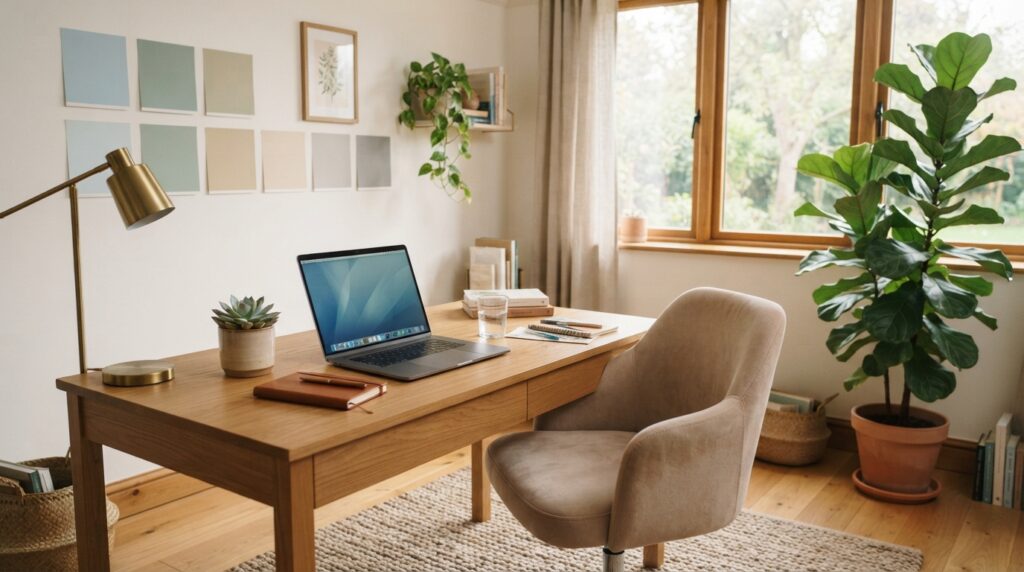
Creating a workspace that feels motivating and personal is essential for productivity. The right hues can enhance focus and creativity while reflecting your unique style. This article presents practical ideas for selecting colors that uplift your environment.
Explore calming blues, grounding greens, warm neutrals, bright whites, cheerful yellows, cozy pinks, and dramatic dark shades. These options not only beautify your space but also influence your mood and productivity.
Little Greene offers 12 paint and wallpaper ideas to help you kickstart your planning. Remember, factors like natural light, furniture, and decor will affect how colors appear in your workspace. Testing samples is crucial to finding the perfect match.
Home office paint color inspiration for a workspace that works
The right environment in your workspace can boost both productivity and creativity. Choosing the right tones is essential. Calming shades can help you focus, while energizing colors can spark your imagination.
Consider these suggestions:
- Muted blues, warm grays, and greens create a serene atmosphere for detail-oriented tasks.
- Bright yellows or muted oranges can energize your space, perfect for creative brainstorming.
- Little Greene’s Obscura and Juniper Ash are excellent choices, providing warmth without feeling stark.
- Select colors based on your daily tasks, whether you need sustained focus or a boost of creativity.
- Combine quiet wall colors with vibrant accessories, artwork, or a colorful chair for balance.
“A well-designed workspace can inspire you to work more efficiently.”
Calm blue paint colors for a focused workday
Selecting soothing tones can transform your workspace into a productivity haven. Soft blues can create an atmosphere that encourages focus and relaxation. For instance, Palladian Blue is a calming soft blue-green that promotes a peaceful mindset during long workdays.
Another great option is Sea Salt, a muted green-blue that supports calm concentration. This shade can blend beautifully with the grayish blue qualities of Little Greene’s Obscura and Juniper Ash, which are also excellent choices for a serene environment.
If you prefer deeper hues, consider Van Deusen Blue by Benjamin Moore. This rich, saturated blue provides a striking backdrop for focused tasks. Alternatively, De Nimes by Farrow & Ball offers a softer, soothing deep-blue option that can enhance your workspace.
When choosing your shades, it’s wise to test them beside white trim, wood furniture, and metallic fixtures. Remember, the undertones can change throughout the day, impacting how the colors appear.
Grounding green shades that bring nature inside
Incorporating shades of green into your workspace can foster a refreshing and serene atmosphere. Green tones not only enhance the aesthetic but also promote a sense of calm and focus.
Consider these excellent options:
- Evergreen Fog: This muted sage green creates a grounded appearance, perfect for a calming workspace.
- Rosemary: Described by Christina Kim as natural and harmonious, this shade is easy on the eyes and adds a gentle touch.
- Card Room Green: A warm and soothing option from Farrow & Ball, it behaves almost like a neutral, adding depth to your walls.
- Fort Pierce Green: Recommended by Linda Hayslett, this Benjamin Moore shade works well on walls or even as a painted desk.
Pairing these greens with dark wood furniture and natural foliage can enhance the connection with nature, making your workspace feel inviting and tranquil.
| Shade | Brand | Characteristics |
|---|---|---|
| Evergreen Fog | Benjamin Moore | Muted sage, grounded |
| Rosemary | Sherwin-Williams | Natural, harmonious |
| Card Room Green | Farrow & Ball | Warm, soothing, neutral |
| Fort Pierce Green | Benjamin Moore | Versatile for walls or furniture |
Warm neutral paint colors for an easygoing office
Choosing warm neutral shades can create a welcoming atmosphere in your workspace. One excellent option is Joanna by Little Greene, a very pale taupe that adds gentle warmth to your walls. This shade works beautifully as a versatile backdrop, making it perfect for an easygoing office.
Another great choice is Fairview Taupe by Benjamin Moore. This rich, deep brown brings depth and pairs naturally with both blue and neutral furnishings. It adds a touch of sophistication while keeping the mood cozy.
For a more productive environment, consider Revere Pewter, Edgecomb Gray, Agreeable Gray, and Anew Gray. These warm neutrals are practical choices that support long work hours without competing with your artwork or accessories.
To enhance the comfort of your space, balance a neutral room with brighter accents. A colorful rug, chair, or lamp can add personality, following Little Greene’s suggestion for making your workspace uniquely yours.
Bright whites that make your home office feel open
Bright, airy spaces can significantly enhance your productivity and creativity. Soft whites create an inviting atmosphere that makes any room feel larger and more open. For instance, White Dove by Benjamin Moore is a warm white that brightens without feeling sterile.
Simply White offers a clean, slightly warm hue that uplifts your workspace. Another excellent choice is Alabaster, which provides a fresh look without glare. To maximize natural light, consider White Sail by Sherwin-Williams, designed to reflect available light beautifully.
These warm whites are perfect for smaller or darker rooms, helping to create an illusion of space. They also serve as a calm backdrop for colorful chairs, rugs, and artwork. Remember to test these whites, as sunlight can reveal undertones that may shift from pink to gray.
Pink and earthy tones for a cozy workspace
Using earthy and pink tones can add a layer of warmth to your workspace, enhancing its charm. Mochi by Little Greene is a delightful soft pink that has a plaster-like quality. This shade works beautifully when applied to all four walls, creating a cozy atmosphere.
For a layered palette, consider Castell Pink. Pair it with Ferdinand, Nether Red, and Arras to build a warm scheme that feels inviting. These shades complement each other and can create a unique vibe in your space.
Dead Salmon by Farrow & Ball is another excellent choice. This rich earthy tone creates a warm, cozy background, perfect for video calls or focused work sessions. Pink and earthy colors harmonize well with dark wood furniture and traditional office details.
To keep your workspace feeling open, keep trim, lighting, and accessories simple. This approach allows the warm walls to shine without making the space feel visually crowded.
Cheerful yellow shades to bring warmth and energy
Infusing your workspace with cheerful tones can uplift your mood and productivity. A great choice is Butter Up by Sherwin-Williams. This bright yellow adds warmth without overwhelming the space.
Yellow and muted orange tones are perfect for creative work, especially in areas with limited natural light. They can bring a sense of energy and vibrancy to your tasks.
Grey Joyner notes that Butter Up behaves almost like a neutral, blending well with various upholstery and decor. If a full yellow room feels too intense, consider using it on a ceiling or as a small accent area.
To create a balanced atmosphere, pair warm yellow with white trim, natural wood, soft blue, or muted green. This combination can enhance the overall feel of your workspace.
| Shade | Brand | Characteristics |
|---|---|---|
| Butter Up | Sherwin-Williams | Bright, cheerful, warm |
| Blush | Little Greene | Mood-boosting, soft |
| Muted Orange | Various | Energetic, vibrant |
Dark paint colors that create a quiet, dramatic office
Choosing darker tones can add a sense of depth and sophistication to your work area. Deep shades can create a calming yet powerful atmosphere, enhancing your focus and productivity.
Consider incorporating shades like Inkwell by Sherwin-Williams, which serves as a striking focal point. Designer Miretta Interiors successfully used this dark neutral to draw attention and create balance.
For added drama, Onyx by Benjamin Moore is a fantastic choice. It shines in naturally lit spaces, as designer Traci Connell demonstrates. Alternatively, Graphite by Benjamin Moore provides a strong, contemplative mood that can help you concentrate on your tasks.
Natural light plays a crucial role when using dark walls. Without it, the space may feel closed in. Balance your dark hues with contrasting decor. Think white molding, lighter furniture, or metallic accents to prevent the colors from feeling flat.
Additionally, consider Little Greene’s Obsidian Green and Scree for an earthy, dark office. Pair these shades with natural foliage to create a serene environment that connects you to nature.
| Shade | Brand | Characteristics |
|---|---|---|
| Inkwell | Sherwin-Williams | Dark neutral, focal point |
| Onyx | Benjamin Moore | Bold, dramatic |
| Graphite | Benjamin Moore | Strong, contemplative |
| Obsidian Green | Little Greene | Earthy, connected to nature |
For more tips on maximizing style in small spaces, check out this guide.
Layer blue tones for a creative, color-drenched look
A vibrant workspace can ignite your imagination and enhance your productivity. One effective way to achieve this is through color drenching. This technique involves using a single hue across walls, trim, shelving, and even the ceiling.
Little Greene suggests a stunning combination of Tivoli, Woad, and Blue Verditer for a creative office. These shades create a harmonious atmosphere that inspires creativity. Alternatively, Delft by Sherwin-Williams allows you to cover your space in one saturated hue, varying the look through different sheens.
For added depth, layer lighter and darker blue values. This approach keeps your workspace cohesive while adding visual interest. Incorporate natural wood, warm metals, or subtle green accessories to maintain a creative vibe without feeling cold.
“Color is the keyboard, the eyes are the harmonies, the soul is the piano with many strings.”
Add personality with an accent wall or painted furniture
Personalizing your workspace can significantly impact your comfort and productivity. One simple way to achieve this is by adding an accent wall. This approach allows you to express your style while keeping the rest of the space neutral.
Consider using Fort Pierce Green by Benjamin Moore on a desk or an accent wall, as recommended by Linda Hayslett. This shade refreshes your office furniture and adds a vibrant touch without overwhelming the space.
A painted desk, cabinet, or shelving unit introduces color without requiring a full-room commitment. It’s a flexible way to enhance your decor while maintaining a cohesive look.
Bright rugs, chairs, and upholstery can serve as accents in a pale Joanna or white office. Coordinate these elements with existing artwork and accessories for a harmonious feel.
Pair office paint with wallpaper for extra interest
Enhancing your workspace with wallpaper can add a layer of visual interest. By choosing the right designs, you can create a space that feels uplifting and inspiring.
Choose botanical or mural designs for an uplifting feel
Consider the Great Ormond Street wallpaper in the Galette colorway. It pairs beautifully with natural wood furniture, creating a tonal botanical look. Another option is the Bird & Bluebell mural wallpaper, which features flowers, leaves, birds, and butterflies. This design brings nature indoors, enhancing your workspace.
Use neutral wallpaper to add texture without overwhelming the room
For a more subtle approach, the Moy wallpaper in Lime and Pompei colorways offers texture and variation without a strong pattern. Additionally, Hencroft-Punch can coordinate nicely with Puck on woodwork, creating a high-contrast scheme.
When selecting wallpaper, consider pulling one paint color directly from the design. This technique helps your office feel cohesive and visually appealing.
Choose paint colors that work with your natural light
Understanding how natural light interacts with your space is crucial for selecting the right shades. Rooms with abundant sunlight can support cooler colors without feeling too stark. This means you can confidently use blues or greens in well-lit areas.
On the other hand, darker rooms benefit from warm, light-reflecting tones like creams and light taupes. These shades help brighten the space and create a welcoming atmosphere.
For example, White Sail by Sherwin-Williams is a fantastic choice for maximizing and reflecting natural light. It keeps your room feeling airy and bright.
Before making a final decision, observe how your walls look in the morning, afternoon, and evening. Remember, the same shade may appear cooler, warmer, brighter, or darker as sunlight moves across the room.
Coordinate your walls with furniture and office decor
Creating a cohesive look in your workspace can significantly enhance its appeal. It’s essential to consider how your wall colors interact with your existing furniture and decor. For instance, Pleat by Little Greene pairs beautifully with dark wood office furniture, providing a sophisticated blue-green backdrop.
Another excellent choice is Repose Gray, which offsets pure white molding. This shade allows colorful upholstery and furnishings to take center stage, creating a vibrant atmosphere.
Additionally, Fort Pierce Green by Benjamin Moore can be used on both walls and desks, adding a refreshing touch to your workspace.
- Assess your existing desks, shelving, chairs, artwork, and flooring before selecting a wall color.
- Pair Pleat by Little Greene with dark wood furniture for a warm, inviting office.
- Use Repose Gray around white molding to keep colorful elements in focus.
- Coordinate blue walls with warm wood, brass, cream textiles, or restrained green accessories to avoid a chilly feel.
- Repeat one wall color in a desk, frame, lamp, or textile for a polished look.
| Shade | Brand | Characteristics |
|---|---|---|
| Pleat | Little Greene | Sophisticated blue-green |
| Repose Gray | Sherwin-Williams | Soft, versatile gray |
| Fort Pierce Green | Benjamin Moore | Refreshing, vibrant |
Select a paint sheen that suits your home office space
Choosing the right sheen for your workspace can greatly influence its overall look and functionality. The finish you select not only affects the appearance but also how easy it is to maintain. Different sheens can enhance or diminish the impact of your chosen hues.
Matte and flat finishes create a soft, non-reflective surface. These options are perfect for low-traffic areas, as they minimize glare and create a cozy atmosphere. However, they are less resistant to scuffs and stains.
Use matte or eggshell for a soft, low-glare finish
Eggshell finishes offer a subtle sheen with added durability. This makes them easier to clean than flat paint, making them a practical choice for your workspace. If you want a soft appearance with a bit more resilience, eggshell is a great option.
Consider satin or semi-gloss for durability and easier cleaning
Satin finishes are ideal for spaces that experience more wear and tear. They provide a balance between sheen and cleanability, making them suitable for offices used by multiple family members. Semi-gloss, while durable and easy to clean, can create distracting glare under direct light.
Remember, the sheen can change how every shade appears. Always test your selected finish alongside the chosen paint color to ensure it meets your expectations.
| Sheen Type | Characteristics | Best Use |
|---|---|---|
| Matte | Soft, non-reflective | Low-traffic areas |
| Eggshell | Subtle sheen, durable | General use, easy cleaning |
| Satin | Moderate sheen, practical | High-traffic spaces |
| Semi-gloss | Shiny, very durable | Areas needing strong cleanability |
Test paint samples before you commit to a color
Choosing the right shade for your workspace can be a challenge. Testing paint samples is the most reliable way to see how a color will behave in your actual space. This process helps you understand how different shades look throughout the day.
Consider using Samplize samples, which are painted with two coats of real paint. This method provides a more realistic comparison than printed color swatches. You can place samples side by side on clean walls to compare multiple colors effectively.
When testing, observe how each shade looks with the lights on and off, curtains open and closed, and after sunset. This will give you a comprehensive view of how the colors interact with your room’s lighting.
- Check every sample beside flooring, furniture, trim, lamps, and artwork.
- View the colors from different angles, like your desk or doorway.
- Consider how each shade makes you feel and if it enhances your focus.
| Aspect | Recommendation |
|---|---|
| Sample Type | Use Samplize for real paint comparison |
| Lighting Conditions | Test with lights on/off and curtains open/closed |
| Viewing Angles | Check from desk, doorway, and video-call position |
Conclusion
Your ideal palette starts with the feeling you want each workday to bring. Choose calm blues, grounded green, warm neutrals, or bright whites for a softer mood. For more drama, try Inkwell, Onyx, Graphite, or Delft.
- Let daylight, furnishings, wallpaper, decor, and finish guide your color choice.
- Add character with an accent wall, a painted desk, a bright chair, botanical wallpaper, or art you love.
- Test real samples at different times of day; screens cannot show every shift in tone.
These ideas help you shape a space that feels personal and supports focus, creativity, and productivity. Pick shades that suit your routine, then give them time to reveal their full effect. With thoughtful choices, your home office can become a welcoming environment for work—and a source of daily inspiration.